Instant Browse Widget | Flipkart
Enabling Users to Instantly Browse and Purchase Products they Discover on Home Page[HP] or Category Landing Page[CLP]
CONTEXT
In Flipkart's e-commerce landscape, a prolonged shopping funnel leads to high drop-off rates. Navigating from the home page to specific products involves a complex maze of category pages, brand exploration, & product selection, resulting in user fatigue and significant abandonment before reaching the desired product.
Users enter either through the home page or the category landing pages.
Direct users land on the home/main page
~80% of Indirect users (social media/ digital ads) land on the category landing pages
~500m users land on either of these pages every single day
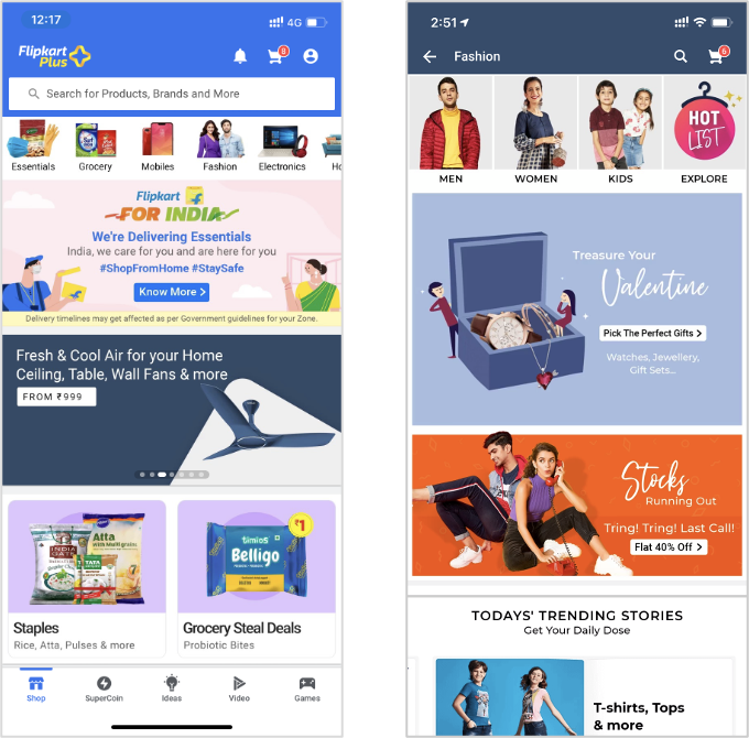
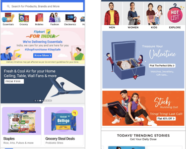
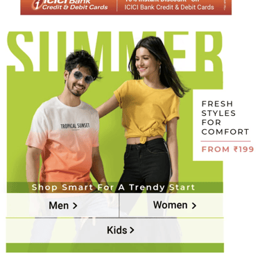
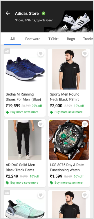
Home Page
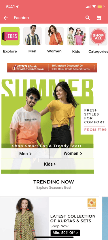
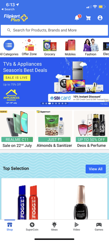
Category Landing Page
USER ENTRY POINTS ON THE APP
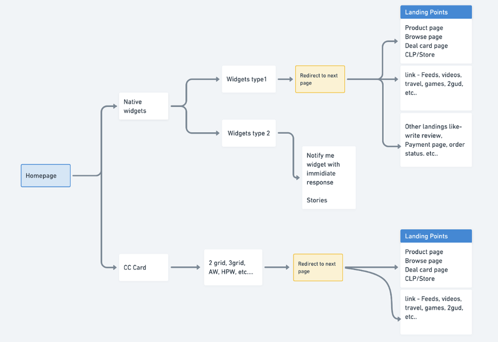
EXISTING ENGAGEMENT WIDGETS (HP & CLP)

Category Navigation
Home Page Widget (HPW)
Announcement Widgets (AW)
Native Widget
One Grid
Horizontal Slider
Home Page (HP)
Category Landing Page (CLP)
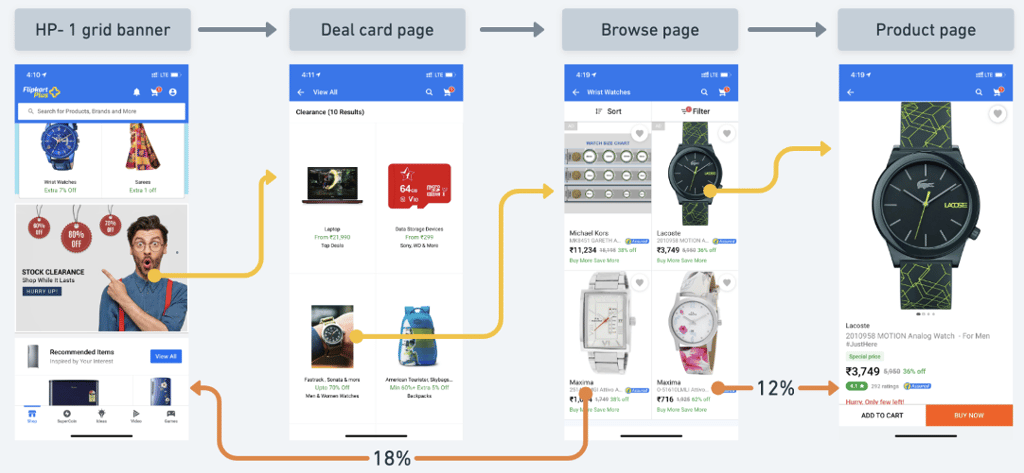
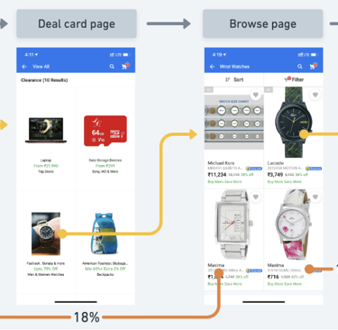
[Homepage] In 99% of the scenarios we redirect a user to a new page to showcase selection and put them into the funnel of multiple pages to reach the desired action they want to perform.
CURRENT USER JOURNEY
There is a ~20% avg drop off at every touchpoint(page) throughout the shopping funnel before the user reaches the final product page
We conducted two focus group discussions - one with internal category owners and another with 15 users
🕵️ RESEARCH
USER FEEDBACK
Dissonance
Customers are unable to find the products that they saw on the home page banners
Validation & Trust
New users felt that the banners on the home page were sponsored ads
Personalisation
Advertisers find it difficult to personalise content on the home & category Pages
Complex Comprehension
At Flipkart we have various deal constructs - all of them seem similar with no clear difference
CATEGORY OWNERS' FEEDBACK
We then studied what our competition was up to for solving challenges like these
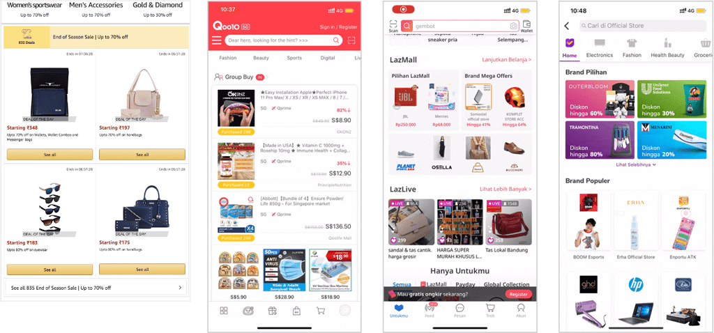
amazon
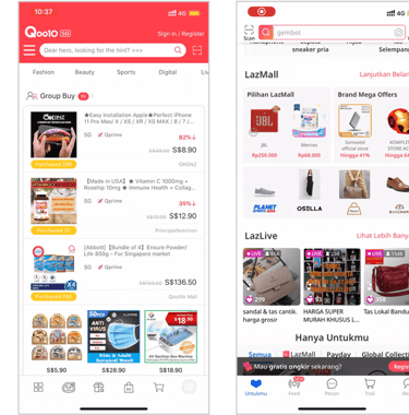
Qoo10
Lazada
Tokopedia
Next, an experiment was conducted for 6 Days- where creative banners were made to mimic a browse like experience
Sales for selected products saw an overall jump of 47.2%
Average CTR shot up to 4.20% . This was 112 bps more than the creative banners in the same slots
RESULTS OF THE EXPERIMENT
By now, we were convinced that showing products upfront on the home page and other category pages would help us not only reduce funnel drop-offs but also help increase conversion
SOLUTION
A hybrid widget that:
Allows the users to browse products upfront on the home page
Enables category owners/ advertisers to easily personalise the content
Allows enough scope for offers and other thematic callouts
Does not occupy more space than the viewport of the user's device
Does not block scroll affordance for other widgets


WIDGET ANATOMY
Header
Filter
Body
Footer
VARIATIONS
Header
Filter
Footer


Body- Grid
Body- List
Body- Grid Carousal
Body- Grid Carousal


Body- 3 Grid

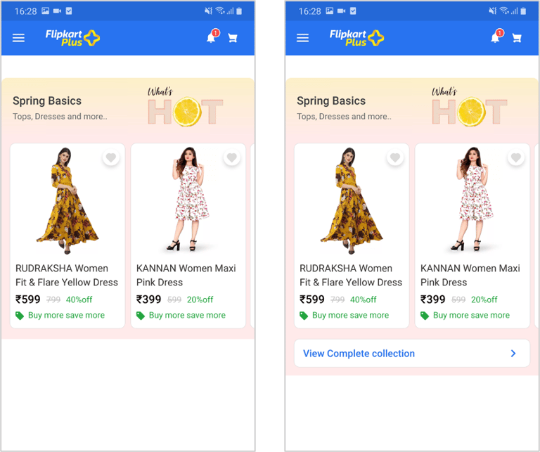
EXECUTION
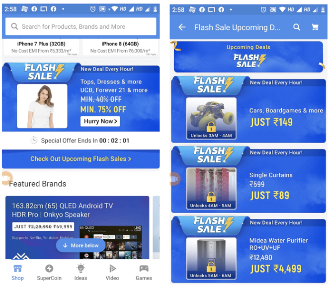
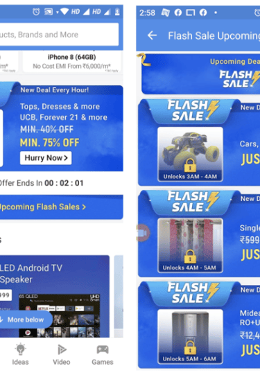
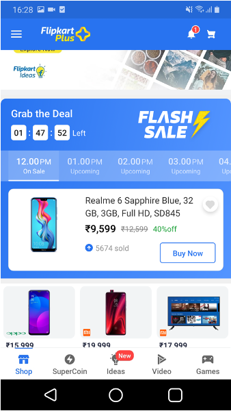
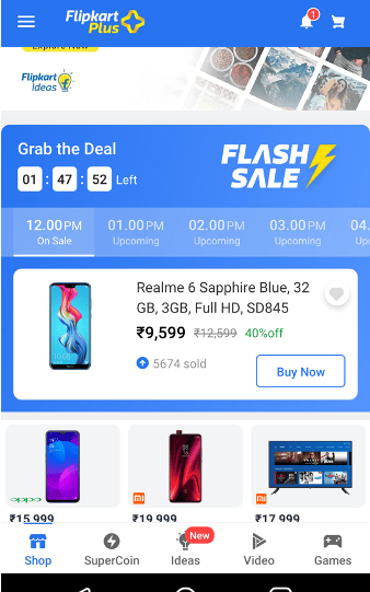
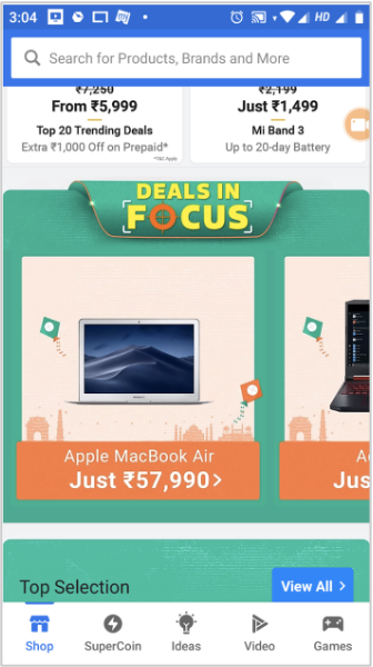
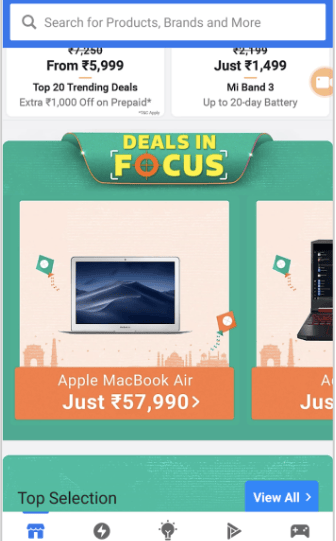
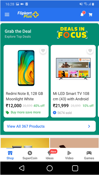
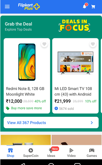
Before
After
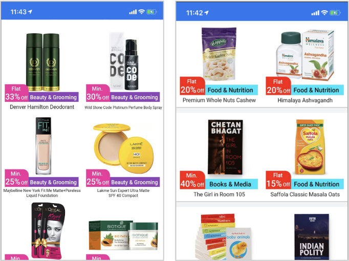
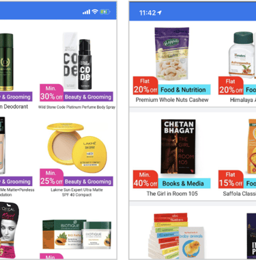
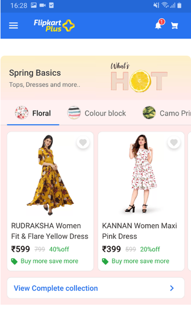
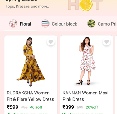
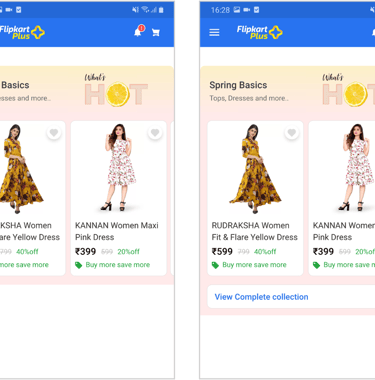
EXECUTION
Before
After
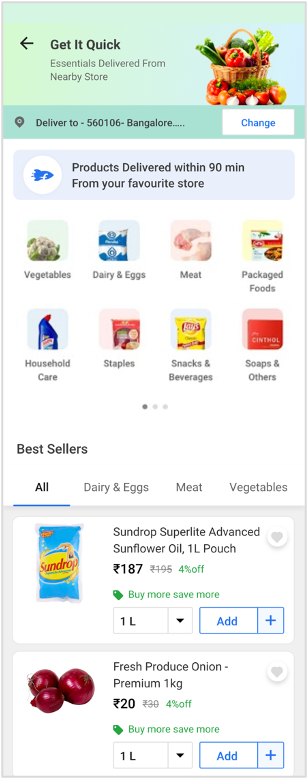
EXECUTION
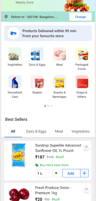

Without Filter & Footer
Without Filter
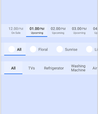
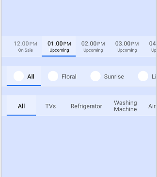
Category Expanded
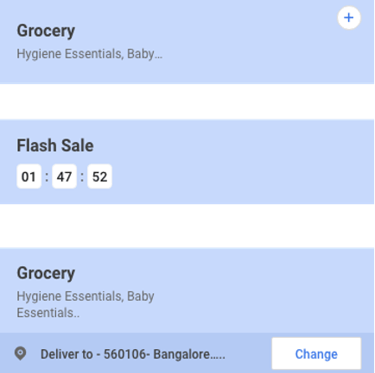
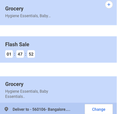
Groceries- List View
~17%
IMPACT
~5%
~3.5%
Reduced
Bounce Rate
Increase in Click-Through Rate
Increase in conversion against static widgets
You didn’t come this far to stop.
I would love to hear from you. Please use the form below for any questions, suggestions or feedback that you may have!